Ask Magazine
Objective/Challenge:
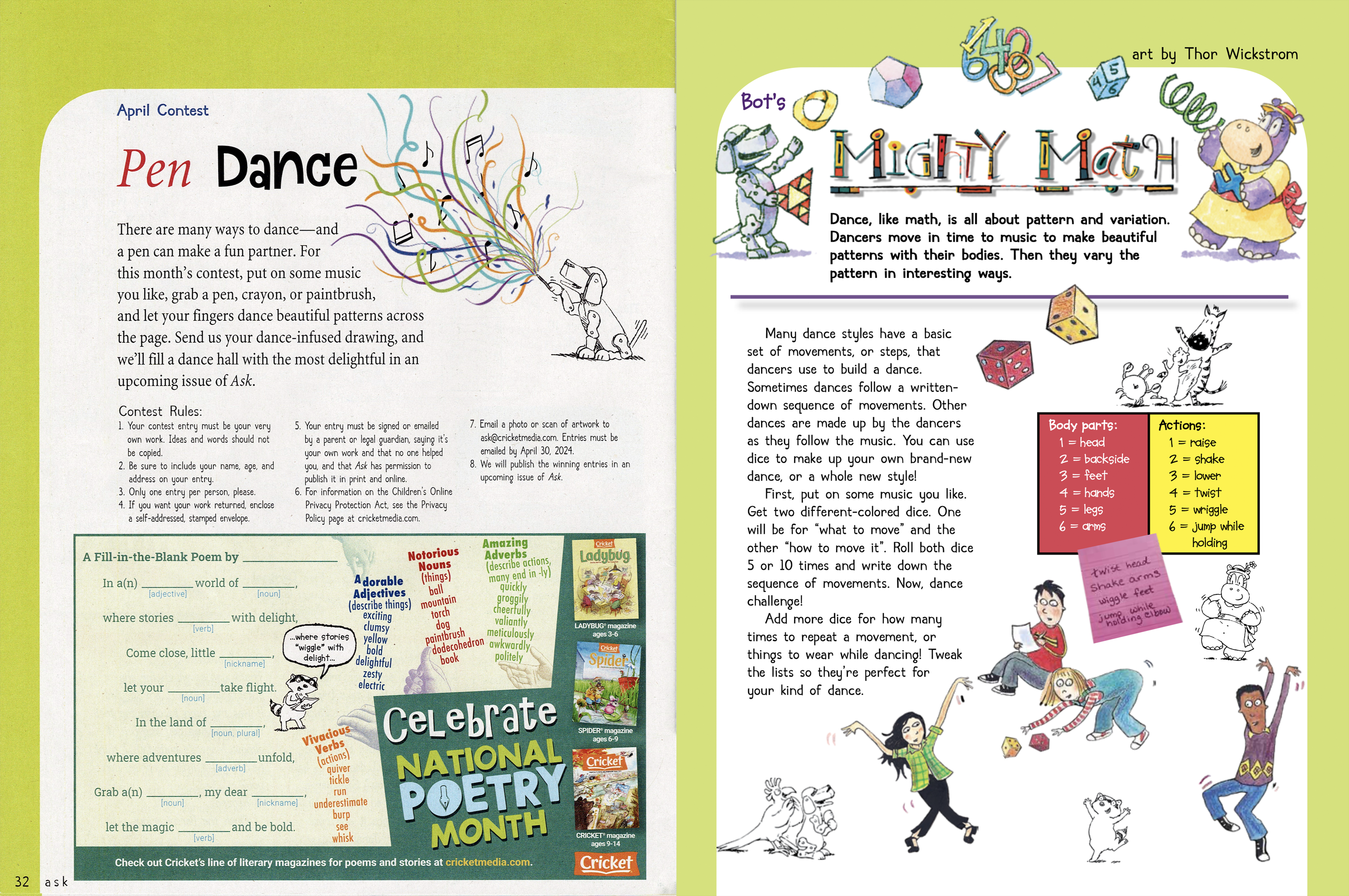
In my work with Cricket Media, Inc., I was tasked with creating layouts within the parameters of the magazine’s brand. The overall tone was dictated primarily by specific typefaces and color palette.
Solution:
Each department had a template upon which it was built. The various elements on each spread was then arranged based on the copy for each issue.
Deliverables:
PDF files for print and digital publishing.
Created using Adobe InDesign, Photoshop.


Cappadocia Magazine Spread
Objective/Challenge:
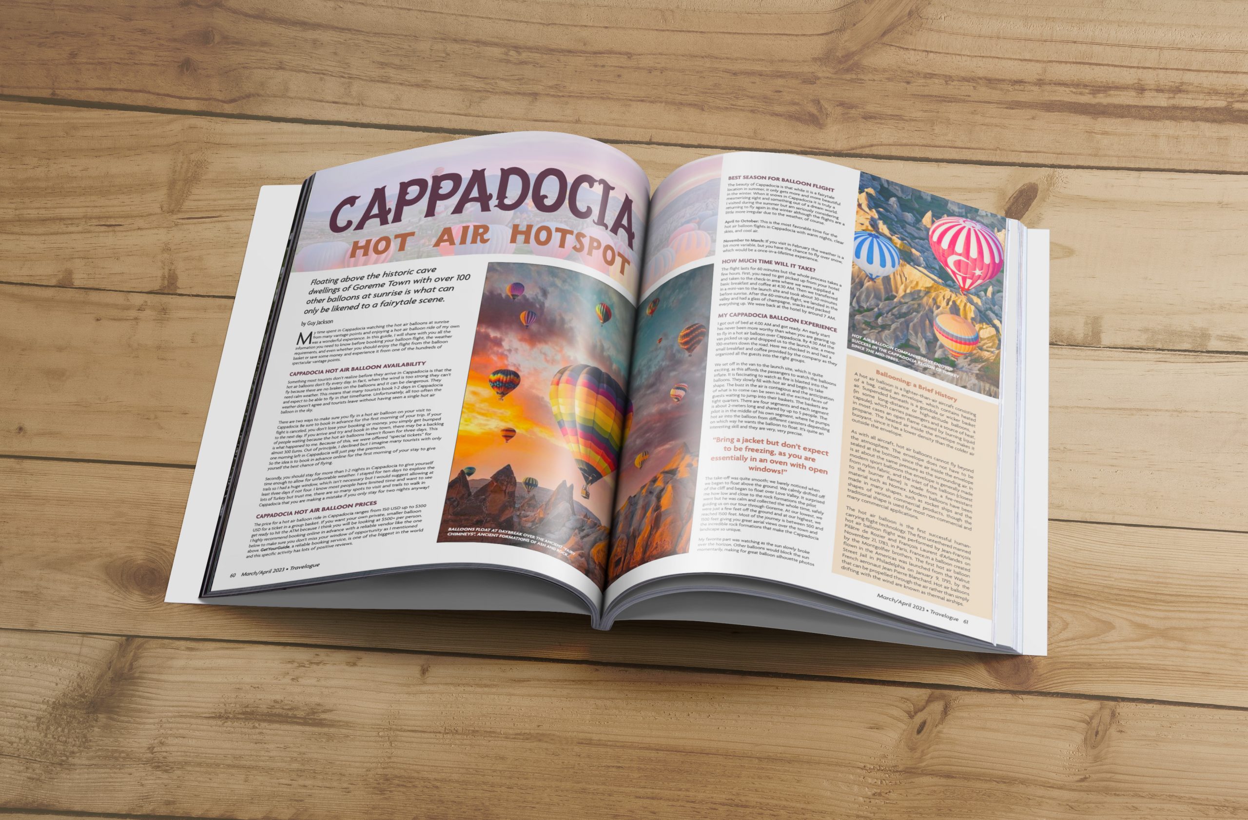
I was tasked with creating a four-page magazine spread centered around a topic of my own choosing.
Solution:
My chosen subject was hot air ballooning, specifically that of the Cappadocia region of Turkey, one of the most interesting and popular areas for the activity. I used the content of a blog post and fomatted it, along with information gleaned from other sources, and melded it with hot air balloon photographs taken in the Cappadicia region of Turkey to create a cohesive and visually appealing spread, including pull quotes, sidebars, and photography.
Created using Adobe InDesign.


Layout thumbnails – a great way to workout options for a layout.
Window Works Studio - Lookbook
Objective/Challenge:
A companion to the company’s website, a resource for interior designers and their clients–using past client projects to showcase the types of window treatments and embellishments possible.
Solution:
Using the established logo and color palette, I made hybrid portfolio/digital magazine which will be updated more frequently than the website, and which will be used to dig deeper into specific interior design examples and options. The file is primarily accessible as a digital document linked to a dynamic QR code, which can be placed on the company’s print and digital media. To see the entire document, click here.
Created using Adobe InDesign.


Window Works Studio - Information set
Objective/Challenge:
Window Works Studio is a high-end window treatment and soft furnishing design and fabrication firm. They have a workroom which interior designers can employ to create the items for their clients.
Solution:
WWS had many disperate documents, all varying in visual aesthetic, for the interior designers to use to manage the needs and expectations between them and the workroom. It was clear that, not only did all the various physical and digital elements need to wear the company’s branding, but it needed to be organized in a well-laid out reference tool.
Deliverables:
I brought all the information together in a concise and clean assemblage with cascading pages of graduated heights. This allows for the audience (interior designer) to be able to quickly get the information she/he is looking for quickly. The pages were printed on a light cover stock, sturdy without being too inflexible.
Created using InDesign, Photoshop.


QR codes are placed to guide the designer to webpages, forms and videos. Each of the six pages is a concise reference tool, giving the designer easy access to Window Works Studio information.
Contralto Cafe - Menu & Event postcard
Objective/Challenge:
My task for this project was to create a name and logo/wordmark for a new food/drink/entertainment venue, its menu, and a postcard announcing an event to be held there.
The business model involves a visual and performing arts venue and eatery serving the finest Continental cuisine made from the best local ingredients, and to create a space where artists and crafts-people can socialize, perform and exhibit their talents.
Solution:
I created a wordmark in which the “alto” portion of “Contralto” is elevated and set in the contrasting typeface used throughout the visual identity. This is to add visual interest and emphasis and to indicate the Cafe’s commitment to promoting the local arts scene.
Deliverables:
The menu contains tasty nibbles in the form of tapas from Spain, light parfaits from France, rich tourtes from Germany, and filling panini, galettes and pasties from Italy, France, and the Cornwall region of Britain. The typography features the brand’s blue and brown color palette, and lithographos of musical instruments compliment the type. A listing of performances and gatherings is conveniently located at the top of the menu.
The postcard advertises a fiber art/yarn-spinning event hosted by a local fiber artist guild in conjunction with the Tour de France bicycle race: Tour de Fleece. The photography is my own work.
Created using Adobe Illustrator, InDesign.


Special Event Card (front)
This is a promotional card advertising an event hosted by Contralto Cafe and a fictitious fiber guild. Photography © 2022 by Jennifer Lane.

Special Event Card (back)
Photography © 2022 by Jennifer A. Lane. For more photgraphy, click here.
Metro - Typeface Poster
Objective/Challenge:
My objective in creating this poster was to showcase the “Metro #2”, a typeface by designer William Addison Dwiggins (1880-1956).
Solution:
Metro #2 is shown in the first two weights released: Metrolite#2 and Metroblack#2. The accompanying text explains the impetus for the typeface’s creation, as well as the reason it is “#2”. The imagery is a manipulated photograph of one of Dwiggins’ marionettes–a self-portrait–the creation of which was a passion of his and the spark he used for the development of his Metro typeface.
Mr. Dwiggins was a man in the business of creating new solutions to typefaces for mass consumption, but he was also interested in the ancient art of puppetry and using time-honored hand skills to create his puppets. I believe he would have approved of the clean lines and legibility of this piece. The neutral tones gives the piece both a warm, modern feel with a nod to Dwiggins’ career as a type and book designer.
Created using Adobe Illustrator, Photoshop.

Contra Dance Letterpress-Style Poster
Objective/Challenge:
This piece came out of a challenge to digitally recreate the style of show poster popularized by Hatch Show Print in Nashville, Tennessee–a letterpress print shop creating concert and other performance posters since 1879. The piece calls for certain typefaces and layout in order to exemplify the gridded characteristics of letterpress printing. The use of textures in an opacity mask where to give the wonderful printing imperfections and aged quality of a poster printed on a letterpress.
Solution:
The subject I chose was for a contra dance I played in Valle Crucis, North Carolina for the Boone Country Dancers. My first attempt at capturing the feel of the Hatch letterpress style resulted in something which resembled a book cover more than a show poster; the typefaces were not slab enough to pull it off. My next attempt was much more in keeping with the original objective. I would like to one day recreate it on an actual letterpress!
Created using Adobe Illustrator.

Magickal Medicinal Collective - Seed Packets & Catalog
Objective/Challenge:
I was originally tasked with creating an illustration for a seed packet. I knew from the outset that I wanted to expand the project from a single seed packet to seven species of plants and a seed catalog layout.
Solution:
The original illustration and packet design was for Belladonna (also known as “Deadly Nightshade”). The company I created to distribute the seeds is the Magickal Medicinal Collective, purveyors of seeds for botanicals used in spells, rites and rituals. The aesthetic is a fun blend of botany, magick and antique whimsy.
Created using Adobe Illustrator, Photoshop, Fresco, InDesign.


Salem Community Orchestra - Concert Program
Objective/Challenge:
The opportunity to work on this project came about when I reached out to the Salem Community Orchestra (SCO) and offered to assist them in upgrading the appearance of their programs and posters. I first approached them regarding the layout of children’s art submissions for the program insert. This is something I had done previously in my work for Ask Magazine, one of the titles I worked on during my employment with Cricket Media, Inc. As my discussions with SCO developed, it was decided that I should also create the layout for the entire program, as well as the performance poster.
Solution:
I knew that readability and legibility would need to be primary concern in this project: readability because these assets deserved to be attractive so that people would want to read them, and legibility so that the more mature audience members (in the case of the program) would be able to read the text without much difficulty.
I enjoyed the challenge of fitting a large amount of important information and imagery into the space allotted. Visual hierarchy played an especially important role.
Created using Adobe InDesign.

Concert Poster

April Concert Program: outside back & front

June Concert Program: inside

June Concert Program: outside back & front


